I'm Starting a Gallery
When Wilbur and I bought the poor farm back in 1998 we envisioned a place where we both could develop and grow into our creative lives. Living here has always been a mixture of wonder and anxiety. The wonder of it is the solitude and space. Nine-thousand square feet is a lot of room to let ones imagination wander. We also love the woods and the fields that surround the property.
The anxiety has always been the cost. Remodeling and maintenance is always completely insane. It's the kind of house that a person with financial common sense would never, ever buy. A few years ago we even nearly lost the place. It took some hustle and scheming, (and asking for help) but we got through.
Another part of our vision has been to share the place with our friends and community. This was a goal right from the start. Within a couple months of buying it we had a musical event and poetry reading. Then I invited a bunch of students to create installations in all the rooms. Since then we've had many more readings, fundraisers, political and musical events, so many in fact that I've lost track.
All this time I had a vision for a gallery space down in our basement. It's really the perfect spot. A decent size, a walkout entrance, a few windows, eight foot ceilings, concrete floors, old stone and brick walls and a great New York loft sort of vibe. I've been hard at work sheet rocking and installing new lighting. We are naming it the Rural America Contemporary Art Gallery or RACAgallery.
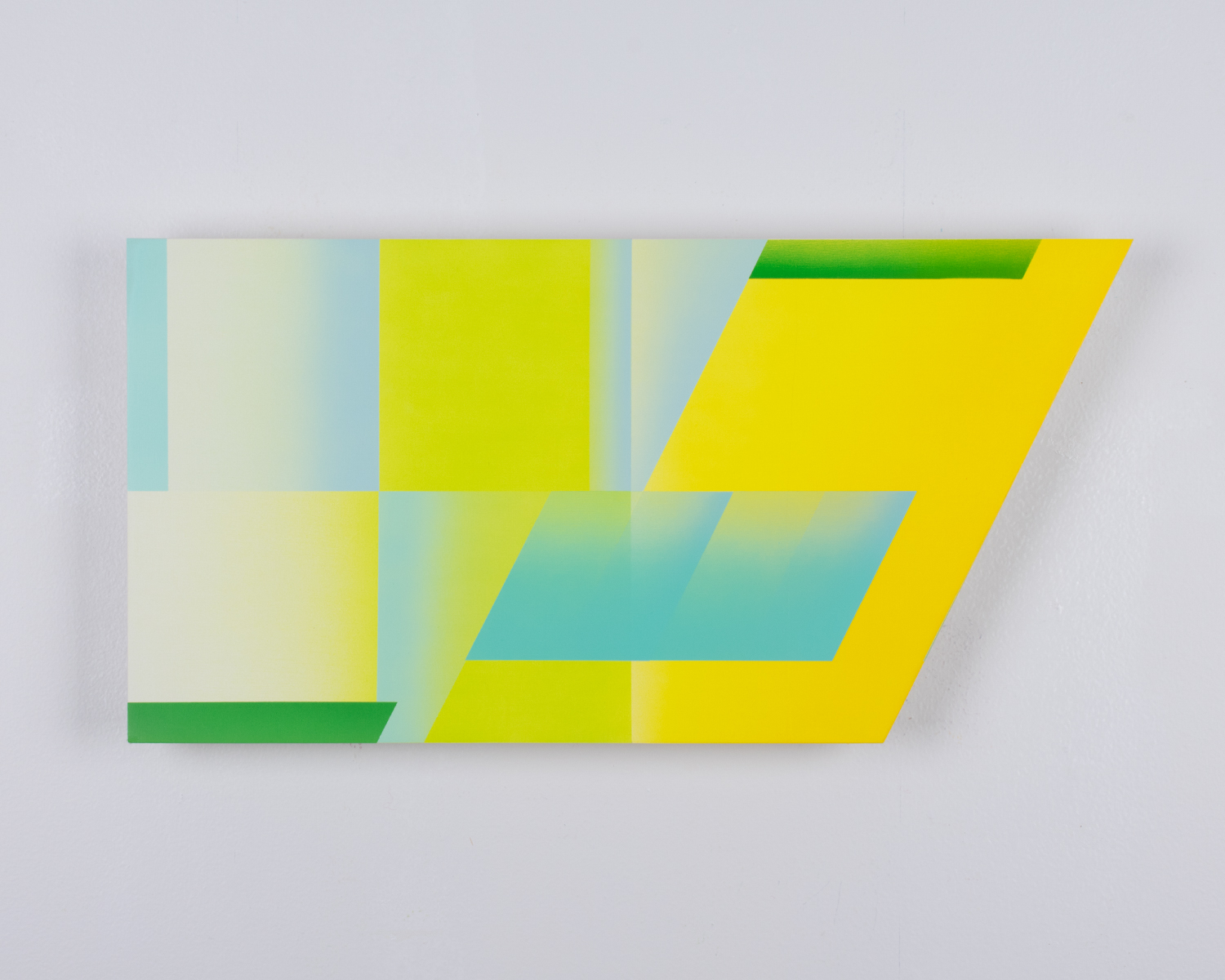
Our first show is the work of my friend and colleague Matt Willemsen. Matt is a graphic designer that creates paintings incorporating his deep understanding of branding and brand identity. His work has this underpinning related to graphic design. His work also possesses a sense of color and space firmly rooted in a dialogue with a lot of contemporary painting. When I think of it graphic design has always had an interesting relationship to the world of commercial design. Andy Warhol is the classic example of an artist using processes, techniques and imagery rooted in the world of design. Or consider the painter Elizabeth Murray and her amazing riffs off comics and cartoons. I view Matt's work as part of this interesting legacy of American art--what we used to call high and low culture.
Plus his paintings are just beautiful to look at and THAT is the most important thing.
So if you are in the Mankato or Southern Minnesota area come by the opening on February 17th, 7-9. It promises to be a great party with some great painting to look at.
Matt Willemsen


